iData Pro can print labels and envelopes that include a variety of elements, such as an address block, static text, field content, graphic images, and/or simple graphic elements such as lines, rectangles, squares, ellipses, and circles. All of these elements are optional. You can design any number of labels and envelopes for whatever special purposes you can imagine. This is one of the most complex procedures to describe, but it is generally fairly intuitive to actually perform. If you've ever used a simple drawing program, you'll find most of the design editing procedures familiar.
For the sake of simplicity, the following text will always
refer to labels, but it will be equally applicable to envelopes, unless
otherwise specified. (From a design standpoint, an envelope is
nothing more than a single label that fills a sheet.) We will use
several typical label and envelope layouts to illustrate the various
design elements
Adding Design Elements
Address Block Tool
Field Tool
Rectangle Tool
Ellipse Tool
Line Tool
Text Tool
Putting It All Together
Adding Graphic Images
Image Resolution
Getting Started
When you create a new label template,
iData Pro will prompt you to: 1. Select a datafile
to be associated with the template. If you are creating a static label,
such as a return address label, that doesn't require any data from a
datafile, you can select "None".
2. Do a printer page
setup. Be sure not only to select a printer, but also to select an
appropriate page size.
3. Create a label or envelope page layout. iData Pro will provide you with a default layout. The page layout dialog for envelopes and the one for labels differ slightly.
Once have finished these steps, you are ready to begin editing the label design. To do this, click the Edit Design button in the toolbar, or select the Edit Design command in the Actions sub-menu, under the Templates menu. A label design sheet will come down that contains the outline of a single label, along with OK and Cancel buttons. The label outline will be completely empty to begin with. A typical large label might look like this:
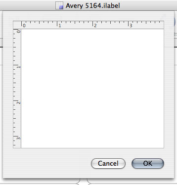
Note: If the label is so large that
the Cancel and OK buttons are below the lower edge
of the screen, you can type the ESC key for Cancel or Cmd-return for OK.
In addition to the label design sheet, you will see the Tools Palette:
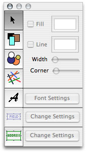
This is a floating palette. You can move it out of the way, so that it doesn't cover the label design sheet. The Tools Palette is used to add all design elements, with the exception of graphic images (which can be added by pasting or importing). The currently selected tool will have a grey background.
Note that if you close the Tools Palette for any reason, you can open it again by selecting Show Tools Palette from the Design sub-menu, under the Templates menu.
 Arrow Tool:
The tool at the top of the palette is the arrow tool. It is used to
select design elements, and to resize and move selected elements. This
is the default tool, and it becomes the active tool after any new
design element is added to a label.
Adding Design Elements
Each of the remaining tools represents a particular design element. These will be explained in more detail below.The basic procedure for adding the various design elements to a label is the same for each one.
To add a design element to a label, first select the desired tool in the Tools palette. Then, click in the label outline, close to where you want the upper left corner of the design element to appear. (A + cursor will appear to show where you are clicking.) Without releasing the mouse button, drag the mouse toward where you want the lower right corner of the design element to appear. When you are reasonably close, release the mouse.
Once a design element appears on the
label, you can adjust its position and size, as explained below. Also,
see Design Sub-Menu for information on applying the menu
commands in the Design
sub-menu of the Templates menu to selected design elements. The
Design sub-menu includes commands for centering selected elements on
the label, and for aligning edges and centers of selected elements.
Note: There are two special
keys that can be held down while resizing a design element. The option key
imposes constraints on
the relative proportions of rectangles, circles, and images, and on the
directions of lines. The details are explained in the sections on each
element, below. The control key
causes the element that is being resized to keep its center in
the same
location. This is especially useful when tweaking the sizes of elements
that are superimposed on other elements.
 Address
Block
Tool: Most templates will include an Address Block element.
This gets the Address Block information from the datafile and displays
it on the label or envelope. (See Datafile
Settings - Address Block for
instructions on determining which text goes into the Address Block for
each record.)
An Address Block is added to a template by clicking the ADDRESS button on the Tools Palette. The Address Block Settings window will appear.
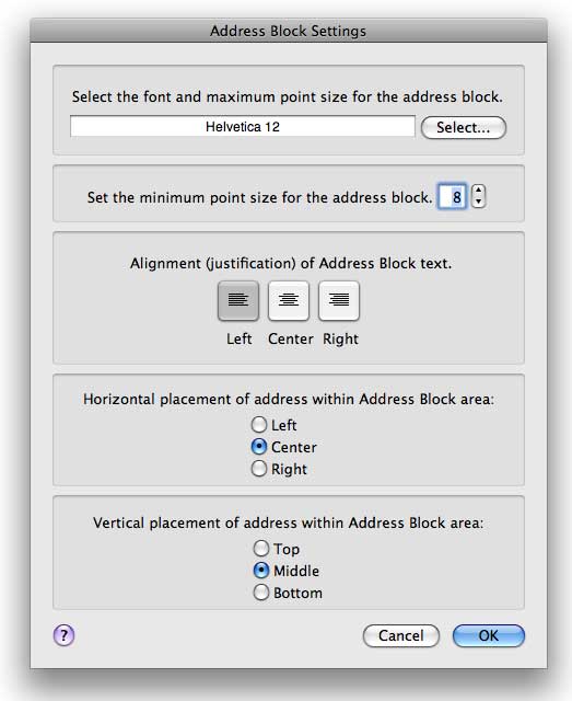
In this window you set the font, its maximum size, minimum size, the text alignment, and where the overall address block fits within the bounds of the the templates Address Block object. iData Pro will shrink addresses to fit in the Address Block of a template. It will start with the maximum point size and see if the address fits. If so, that is the point size that will be used. If the address does not fit, it will begin reducing the font point size until the address fits, or the minimum point size is reached.
For addresses on envelopes, 12 points is a good maximum size and 8 pt. is about the minimum size that the Post Office can deal with. For a package or name tag, you might want to use a larger maximum size. It's also a good idea to use one of the fonts recommended by the Post Office for legibility, such as Helvetica or Times Roman.
To set the font and maximum size, click the Select... button. The standard OS X Font Panel will appear. Set the font, style, and size and close the Font Panel.
To set the minimum point size, simply
click the up or down arrows. Or, type a value into the text box.
To set the address block text alignment,
click one of the buttons that show the three options. Alignment in new
address blocks defaults to Left,
and it is recommended that addresses be left aligned (except, perhaps
in Hebrew, Arabic, and other right-to-left scripts). However, address
blocks can be used to print labels other than just mailing labels,
which is why this option is available.
To set the horizontal and vertical
placement of the address block text within the Address Block area (the
green outline shown below), click the desired radio buttons. The
defaults for new address blocks are Center and Middle. A common reason
to change this is if you have something like a bit of text saying To: and want the start of the
address to always line up with that, in which case you would set them
to Left and Top, which would result in something
like this:
To: Fred Smith
123 W. Main St.
Smithville, CO 12345
When you are done with the Address Block Settings, click the OK button.
Next, click in the label design sheet and drag a rectangle for the Address Block from the upper left to the lower right. To distinguish the Address block from rectangle graphics and Field blocks, it has a green outline, and has the word "Address" in the upper left corner.
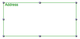
After you release the mouse button, an outline will appear that has small square adjustment knobs at each corner, and at the center of each side. These knobs show that the Address Block is selected. When an Address Block is selected, you can adjust the size of the Address Block by dragging one of the adjustment knobs. Clicking anywhere on the Address Block rectangle will select it. This rectangle represents the maximum size of the address that will fit on the label or envelope. You cannot type text into this rectangle because it uses text based on the datafile's Address Block settings.
The font settings for the Address Block can be changed later by selecting the Address Block so that the knobs are visible, and then clicking the Change Settings button next to ADDRESS on the Tools Palette.

 Field
Tool: Data
from fields can
also be printed on labels. Some of the reasons you might want to add
field
data to a mailing label or envelope are adding a customer code, phone
number, renewal date, product serial number, etc.
Other uses would be for name tags, event
tickets, slide labels, price tags, CD & DVD labels, etc. You could
even create forms like invoices by setting up a template that has one
label that is the same size as the page.
Note: The Field button will be disabled unless
the template has an associated datafile that includes at least one
field.
A Field element is added to a template by
clicking the Field button on
the Tools Palette. The Field Settings
window will appear.
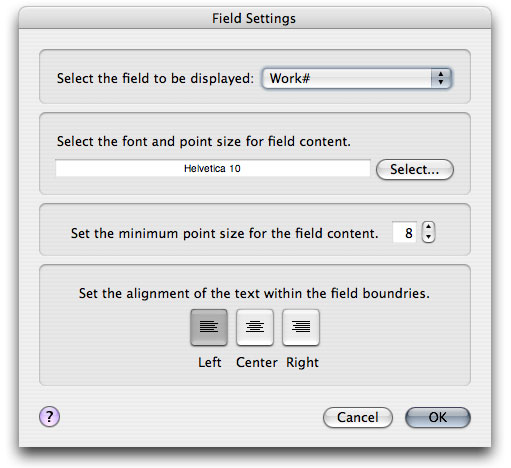
The first section lets you select which field is to be used. Select the desired field in the popup menu. Data from this field in the associated datafile will be displayed in this Field Object.
The second section allows you to set the maximum point size. iData will attempt to display the data at this point size. If it does not fit, the point size will be reduced until it fits, or reaches the minimum point size.
The third section allows you to set the minimum point size. The text in the field will not be displayed smaller than this point size.
The last section aligns the text within the box on the template.
Placing the Field Object
Once the Field Settings are complete, click OK. Then click in the label design sheet and drag a rectangle, starting from the upper left to the lower right of where you want the Field Object to appear. The field will be outlined in blue, and will show the name of the field, also in blue.
The height of the Field Object box will be determined by the maximum point size. You set the length of the box. You can re-size a selected Field Object box and move it by dragging or with the arrow keys. It is selected when the adjustment knobs appear on the box.
 Rectangle
Tool:
You can add rectangular blocks
to your label design. A rectangle may be any color that your system
supports, or it may be transparent. A rectangle may also have an
outline of a different color. The width of the outline can be set, as
well.
To add a rectangle to a label:
1. Click the rectangle tool in the Tools palette.
2. Click and drag in the label outline to create a basic rectangle. After you release the mouse button, an outline will appear which has small square adjustment knobs at each corner, and at the center of each side. These knobs show that the rectangle is selected. When the rectangle is selected, you can perform a variety of adjustments on its size, location, color, and shape, as described below. You can select a rectangle (or any other design element) by clicking on it. (See more details on selecting and deselecting design elements below.)

3. Adjust the location of the label by clicking inside its borders and dragging it.
4. With the rectangle selected, adjust its size and shape by clicking and dragging any of the adjustment knobs.
To
constrain a rectangle to always
be a perfect square, hold down the option
key while dragging any of the
knobs.
To
have the rectangle keep its center in the same location while resizing,
hold down the control key
while dragging any of the knobs.
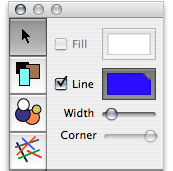
5. Once you are satisfied with the size and location of the rectangle, click it to select it. When it is selected, you will see that three options become available in the upper right portion of the Tools palette:
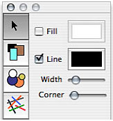
a. The Fill option determines whether the rectangle is filled with a color, or whether it is transparent. The default setting is transparent (With the Fill checkbox deselected).
To set the Fill color:
1) Select the Fill checkbox.
2) Click in the color well (the doubly-outlined rectangle at the left of the Fill checkbox.
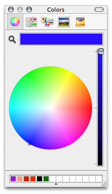
3) This will cause the Colors Panel to come up. Select a color in the Colors Panel.
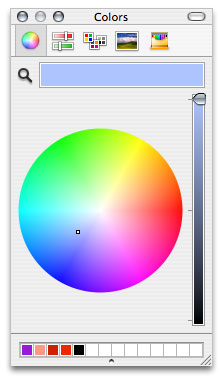
The selected color will show up in both the color well and the rectangle on the label.
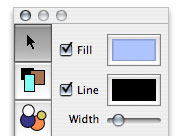

b. The Line option determines whether the rectangle has an outline. The default setting is black, with the Line checkbox selected. If you want a rectangle without an outline, just deselect the Line checkbox.
To set the Line color:
1) Select the Line checkbox.
2) Click in the color well (the doubly-outlined rectangle at the left of the Line checkbox.
3) This will cause the Color Palette to come up. Select a color in the Color Palette.
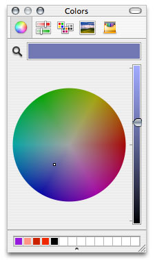
The selected color will show up in both the color well and the outline of the rectangle on the label.
4) Adjust the width of the outline, by moving the Width slider. The outline width can be adjusted to anywhere from 1 to 10 pixels.

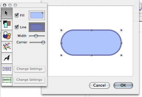
c. The Corner slider controls how rounded the corners of the rectangle are. The default setting is no rounding--perfectly sharp corners--with the slider at the extreme left, as shown above.
To produce moderately rounded corners, move the slider slowly to the right, until you like the way the rectangle looks.

To produce a rectangle with completely semicircular ends (a cartouche shape), move the slider all the way to the right.
 Ellipse
Tool:
The ellipse tool works exactly like the rectangle tool, except that the
Corner slider is not
available (since ellipses don't have corners).
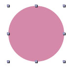
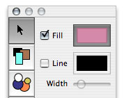
To constrain an
ellipse
to always be a perfect circle, hold down the option key while dragging
any of the knobs.
To have the circle keep its center in the same
location while resizing, hold down the control key while dragging any of
the knobs.
 Line Tool:
The line tool can draw a
line at any angle.
To constrain a line to be perfectly horizontal, hold down the option key after beginning dragging one of the knobs in a generally horizontal direction.
To constrain a line to be perfectly
vertical, hold down the option key
after beginning dragging one of the
knobs in a generally vertical direction.
To have the line keep its center in the
same location while resizing, hold down the control key while dragging any of
the knobs. This works best when the line is also being constrained to
the horizontal or vertical.
The default color for a new line is black, but when a line is selected, its color can be changed by clicking the color well next to the Line checkbox.
When the Color Panel comes up, select the desired color.
Note that a line element has only two adjustment knobs.

 Text
Tool:
The text tool lets
you create a block of styled text--a text element. Once the block is created, it can be
moved and resized. You can type text into a text block, then highlight
(select) any part of that text, and apply formatting to it using the
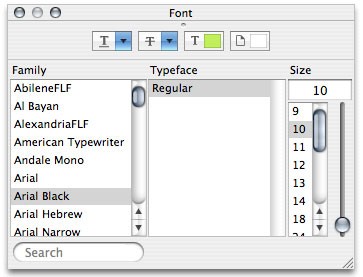
Font Panel, the Colors Panel, and the commands in the Format menu.
To create a text element, click the Text
tool button in the Tools Palette, then click in the label outline and
drag it out
to the desired size. Once it is approximately the right size, release
the
mouse button, and an outline will appear, with a blinking text
insertion point. Note that the label outline does not automatically
adjust to the text that is entered, so it may be best to make it a bit
larger than necessary.

After typing the desired text, you can highlight a portion of the text and apply formatting to it. If the text element that you want to change is not selected, clicking it once will show it selected, with no outline, but with adjustment knobs. In this state, it can be resized or dragged to a different location, but the text cannot be edited.

Double-click the text element to make the text editable. The adjustment knobs will disappear, and the outline will reappear. Highlight the desired text and apply formatting to it. (The yellow background in the example is simply the text highlight color that was set on the system on which the example was created.)

Putting It All Together
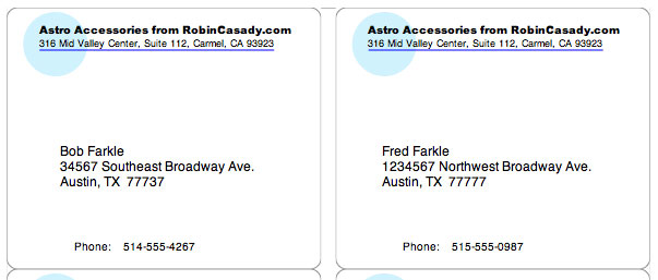
Here's an example of how several of these design elements can be put together into a custom mailing label.
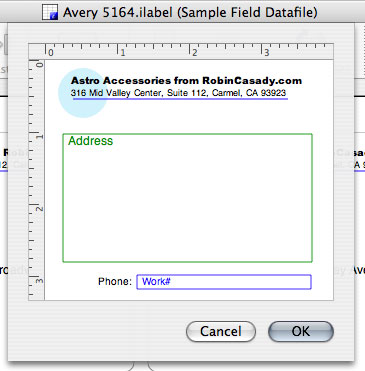
The text block shown above has been combined with the blue line and an light aqua circle (filled, but with no outline ) to produce an attractive return address.

An address block has been added, using the default settings.


A field element has been added to show the recipient's work phone number--a useful detail for a shipping label.


Here's what it looks like when all these elements are combined in the Edit Design window. (Note that another text item has been added next to the field element, to identify it.)
And here's what the labels will look like when printed.
Adding Graphic Images to a Template
The one design element that is not
represented in the Tools Palette is the image element. Images can be added either by copying
an image
and pasting it into a template in the Edit Design window, or by
dragging an
image file (JPEG, GIF, or TIFF) into the Edit Design window. (In order
to
get the best quality out of your printed images, be sure to read the
section on Image Resolution, below. (Note that the images embedded
in iData Pro datafile records, or in TextEdit files, cannot be pasted
into the Edit Design window, as they are text attachments, and are not
in a supported image format.)
When an image is added to a template, it
appears selected, with an adjustment knob at each corner.
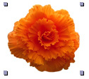
When an image element is deselected, the
adjustment knobs disappear.

As with the other design elements, an
image may be selected by clicking on it, and may be dragged around in
the Edit Design window.
Unlike other design elements, images have a maximum size. This is the size of the original image. Images cannot be made larger than that original size.
If the added image is too large to fit the Edit Design window, it will be automatically shrunk to fit. It can be made larger (up to its original size) by dragging one of the adjustment knobs. It can also be reset to its original size by selecting it and choosing Make Natural Size in the Design sub-menu of the menu. If this produces an image that is too large to manipulate, it can be sized to fit in the window again by selecting it and choosing Shrink to Fit in the Design sub-menu.
When an image is resized by dragging one
of the adjustment knobs, it will automatically maintain the proportions
of the original image. If you wish to have iData Pro ignore the original
proportions while resizing, hold down the option key while
dragging the knob.
If you release the option key while
resizing, iData Pro
will immediately revert to maintaining the original proportions.
Because maintaining the original image
proportions involves changing one dimension or the other of the image
size during resizing, the mouse pointer may not track the adjustment
knob as closely as it does with other design elements, and the resizing
will not appear as smooth. If this bothers you, you can hold down the option key while
resizing and only
release it when you get the image close to the desired size.
To have the image keep its center in the same location while resizing, hold down the control key while dragging any of the knobs.
Here's a sample mailing label that uses an image element, combined with styled text in the return address, and a green rectangle with rounded corners (and no fill or a white fill) to offset the mailing address. While the example shown here is a mailing label, something similar could be done with an envelope template.
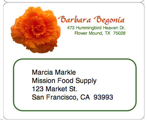
Image Resolution
The resolution of an image is a number that determines how many pixels (dots) will be printed per inch (or cm). Most images have a resolution number in the file. Images copied from the Web may not have a resolution number. Applications usually consider these images to be 72 dpi (dots per inch). The resolution number can be set in graphic editing software like Photoshop, or Photoshop Elements, through the Image Size command.
The two flower images below represent an image that is 225 pixels across. The image on the left represents the size this image would print if its resolution were set at 72 dpi. The image on the right shows the size it would print at 300 dpi. Pixel for pixel, they are the same images.


When an image is pasted or dragged into an iData template design window iData looks at the image resolution to determine the size it is to be printed. With a 225 pixel wide image set to 300 dpi, iData will print it about 0.75" wide. If the 225-dpi image were set at 72 dpi, iData would print it about 3.125" wide. iData will display the image at the appropriate printing size in relation to other elements on the template.
The original Macintosh screen resolution was 72 dots per inch. Most inkjet printers can print images at various resolutions. Typical printing resolutions are from about 180 dpi to 300 dpi. The higher the number, the greater the detail -- assuming the printer is capable of utilizing the resolution.
It is best to create your images at resolutions that match the best resolution that your printer is capable of. A 72-dpi image may look good on the screen, but will probably appear a bit fuzzy when printed, with diagonal lines appearing somewhat jagged.